How to Use Golden Ratio in Logo Design
If you’ve experienced designing or see Company Branding Design Ideas or had a chance to see how designers work, you might have witnessed them using rectangles or circles to form their logo designs. They are not using them randomly without purpose, in fact, they are using one of the most ancient formulas that make any design look attractive and pleasing to the eye “The Golden Ratio”.
Today, we are going to discuss the Golden Ratio in logo designing and in Company Branding Design Ideas, what is the Fibonacci sequence, and why you as a designer using it.
How the Golden ratio in logo design can be beneficial for you:
· The golden ratio act as your design grid, and framework for the right decisions.
· The designs built according to the golden ratio are considered more beautiful and pleasing, and the logos you deliver to your clients may become more valuable.
· The logos designed according to the principles of nature, are a lot more memorable than their more chaotic counterparts.
· The human brain enjoys sounds, views and situations of its prediction. If designed according to the Golden ratio, the logos becomes more pleasing and harmonic.
What is the golden ratio?

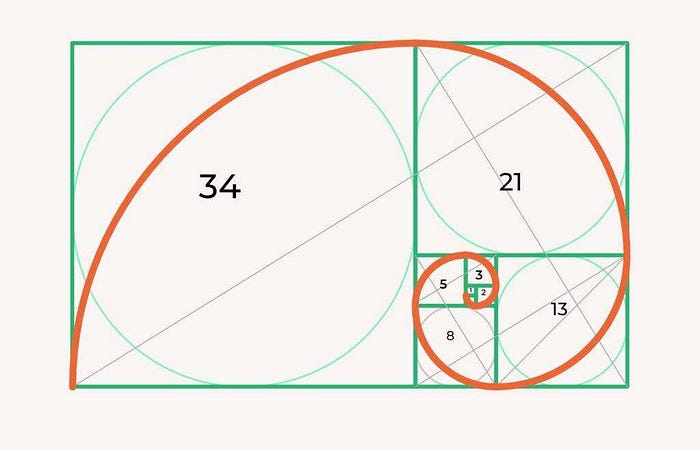
The ratio is simply the relationship between 2 or more 2 elements. The Golden ratio will create if the proportion is 1:1.618.
So, how do we get the number 1.618?
The number originates from the Fibonacci sequence: 0,1,1,3,5,8,13,21,34 …. The next number in this sequence is a combination of the previous two numbers.
The further we go, the ratio of two consecutive numbers from the sequence gets closer and closer to the Golden Ratio, 1.618.
In its case, the golden ratio is the relationship between two quantities/numbers where the ratio of the small quantity (a) to the large quantity (b) is the same as the ratio of the large (b) to the whole (a+b).
Fibonacci Sequence

To obtain to the Golden Ratio, we need to understand the Fibonacci number sequence first. It can be found all over I nature, in the number of petals of flower to the spirals in a sunflower or keys on a piano. Once you understand this sequence, you’ll start to see it everywhere. This sequence is the mathematical rule on which our world is created.
The sequence is:
1, 1, 2, 3, 5, 8, 13, 21…
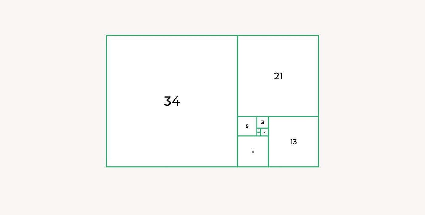
So let’s see how it works. Each number after the first two numbers in the Fibonacci sequence is the sum of the 2 numbers before it.
If we visualize Fibonacci’s sequence, here’s what it would look like:
How to use Golden Ratio in logo design:
We understand that you might be confused after all those numbers. Don’t worry, this is a lot more interesting. As you understand what is the Golden spiral and how it works, you can start using it in your Company Branding Design Ideas and logo designs.
Use Shapes
The golden rectangle will become your best buddy. The parts of golden rectangle can be used as a grid to form the basis for your logo design and also act as a foundation for new Company Branding Design Ideas.
For example, try engraving the circles into each of the internal squares. A series of circles you get can be used to create more round logos, like Apple or Twitter ones.

The above picture is the design of the famous brand Apple Inc. This is one of my personal favorite marks, as it creates the deeper meaning of what their brand is about, our imperfections of being human, and striving to being better humans, as the apple with a bite taken out of it references the biblical story of Adam and Eve and the Sin. Here you can clearly see how the use of the golden circle transforms a complex form into a simple and quickly recognizable mark.
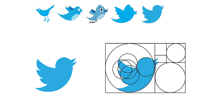
You can clearly observe the Twitter logo‘s evolution above, the left most image shows hand-illustrated artwork of the bird with proportions close to a real bird, but when viewed by zooming in as small icon, becomes distorted and hard to recognize clearly. At the rightmost image, you can observe how the bird design had evolved to a highly simplified icon that is easy to visually read. This icon, along with Apple’s icon, is among the most recognizable and well-known icons on earth. I see these icons as being in their simplest and truest form.
Use Proportions
Another way of using the Golden Ratio is to measure the height and width of the logo as well as the proportions of the internal elements to the whole logo.
Use Placement
The Golden rectangle is also used to place the objects, and confirm what composition is the best. Using the rectangle grid, you can engrave the elements into it. This is how you ensure all of the parts of your logo are placed harmonically and don’t ‘offend the eye’ of the observer and suitable for Company Branding Design Ideas.
The Bottom Line
For now, it won’t be awkward for you to think ‘Is it necessary to use the Golden ratio for Company Branding Design Ideas or to create logos? What if I don’t want to use Golden Ratio in logo design? Will my designs look bad if I don’t follow the rule’?
After all, it is not mandatory that you have to use the Golden ratio in logo design. However, using it is a way for you to bring more thoughts and innovations into the logo, making it more memorable and admirable. It is another way for you to add more value to the client. I personally found some good designers to follow these rules in logo designing, and create a meaningful and pleasing logo, you can reach them here: